DESIGN SPRINT
Rethinking Refunds in Jane App
Overview
During my time as a Support Specialist at Jane App, I noticed that refund requests often created more confusion than clarity. Clinics frequently relied on support to complete refunds, which signaled a deeper issue: the experience wasn’t intuitive.
The workflow didn’t match how clinic staff expected it to work. It was inconsistent, unclear, and lacked essential features, creating friction in a space that should feel straightforward.
I wasn’t on the Design team, but I had recently finished a UX Diploma and saw an opportunity to reimagine the refund flow through the lens of real user pain and propose something simpler, more consistent, and respectful of users’ time.
🔖 Role – Support Specialist / UX Designer (self-led)
🕒 Timeline – 6 weeks (2024)
🧰 Tools – Figma, Notion, Help Scout
💬 Collab – Reviewed with Design, PMs, Devs
🎯 Goal – Improve refund UX to reduce confusion & support dependency
The Problem
The refund process in Jane App is a high-friction, high-touch task that lacks consistency, context, and clarity. While issuing refunds is a routine part of clinic operations, the experience in Jane is fragmented, requiring different workflows depending on what’s being refunded (service, product, package, or membership). This complexity increases cognitive load for clinic staff, leads to errors or incomplete refunds, and ultimately undermines user confidence.
At its core, the problem isn’t that refunds are impossible, it’s that the process doesn’t match the mental model or real-world needs of the people performing it. The current design fails to support confident, independent task completion, which erodes trust over time.

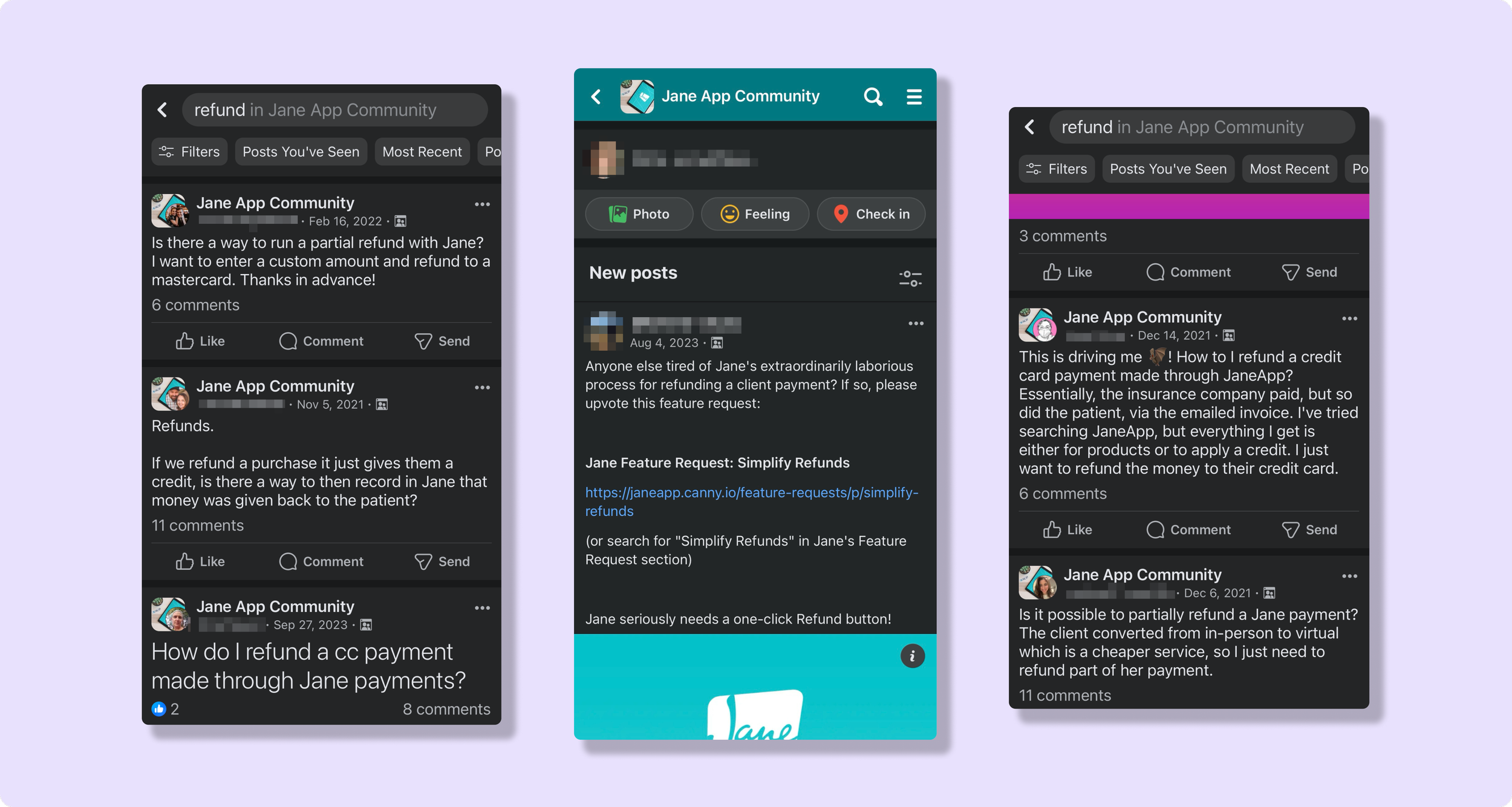
What Jane’s Customers Are Saying
Drawing from my own experience on the support team at Jane and assisting with refunds, I knew that this was a task that many clinic owners and front desk staff struggled with. I went to Jane’s public forums to capture direct quotes that reflected how customers feel about the refund experience.
Let’s hear from Jane’s clinics…
“I find refunds extremely painful to deal with, especially with insurance attached. It’s so horribly painful. And that’s a straightforward refund. Please find a way to simplify this. It seems to make the issues so much worse when you have an upset patient waiting for their money.”
“It’s very frustrating having to refund patients, especially when my clinician has to do it. She gets so confused and I end up having to fix it.”
“My admin were confused and thought refunding wasn’t possible because there is no clear refund button or option. It really needs to be simplified!”
Jane App’s Community Facebook Page
Searching the term “refund” in Jane’s community page resulted in many users looking for support and highlighted some pain points that prove the difficulty in giving refunds. Jane’s customers also called attention to not being able to do partial refunds in Jane (without a workaround that doesn’t accurately reflect the invoice status!)
Support Trends
The topic of refunds generates approximately 50 conversations per day for Jane’s Support team with the average conversation taking 30-45 minutes to reach a resolution.
Refunds and the workflows surrounding this task were consistently the most common searches within the customer facing support chat tool. In only one week in March 2024, there were nearly 600 instances where “refund” was referenced in some way by users looking for support.
Let’s hear from Jane’s Support Team…
I surveyed my colleagues in the support team to gather insight into how often the topic of refunds comes up and what their experience is like assisting clinics in reaching a solution.
“Refunds are super challenging for sure, I find the most often I get a call because they clicked Refund Purchase… Yes it does state “refund”, and there is a pop up, but mostly they read “Are you sure you want to refund this purchase?” and then click Yes. Weeks/months later the patient reached out because they did not get their refund, so the clinic looks bad since they thought they refunded when they did not. There are a few extra steps to get refunds done, so that can be confusing.”
“I got 4 calls in a span of 2 days that were simply to confirm that the refund was completed. Clinics are always worried to refund hence why they always call because they want our support walking them through it every time (common sentiment). The painful part is when they gotta do a partial refund and they don’t have an invoice attached yet - it’s quite painful and sounds super “out there” to get a ‘simple task’ done.”
“My experience is the same as everyone above, but the one thing I wanted to add is that once I’m done those calls, I’d say less than 50% of the clinics feel confident that they’ll remember the workflow next time it comes up.”
Stepping into the shoes of the user
👟
Stepping into the shoes of the user 👟
So, why would a patient need their money back?
Refunds are a regular admin task of most businesses that process payments. Digging into support trends, these are the common reasons that clinics need to perform refunds:
Patient purchased a product that was damaged or they were unsatisfied with the product
Patient was dissatisfied with their service and are requesting a refund
Admin error – the clinic accidentally charged the wrong credit card, or did not know the patient had an active package/membership and was not meant to charge them
Retroactive discount – clinic meant to or wants to offer a discount after the full amount was paid, so they would like to offer a partial refund
Patient’s insurance response states a lower copay than what the patient was initially charged so they need to refund the difference
The clinic has a pre-payment online booking policy and the patient cancelled within the timeframe that is eligible for a refund
It’s evident that there are many reasons a refund may be required in a clinic setting. One of the pain points for the current refund flow is that the item that needs to be refunded (product, service, package, or membership) influences how users go about the task. Having so many paths to achieve refunding a single payments results in more cognitive load and a lack of confidence the next time a user needs to process a refund.
Scroll down to see refunds in action 👇
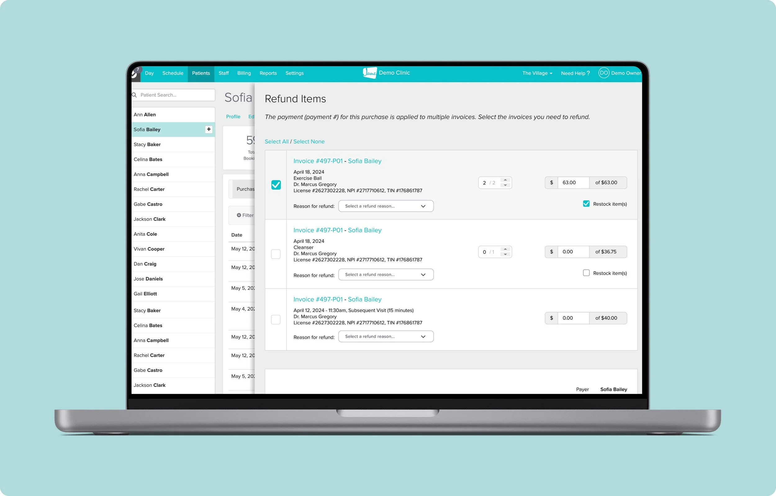
Refunds in Action
This 10-minute walkthrough steps into the shoes of a clinic admin navigating Jane App’s current refund process. You’ll see three real-world scenarios involving refunding products and services, and the decisions, screens, and friction that come with each.
💡 TIP: Hit the settings wheel ⚙️ and increase quality to 1080P HD.
User Journey Map
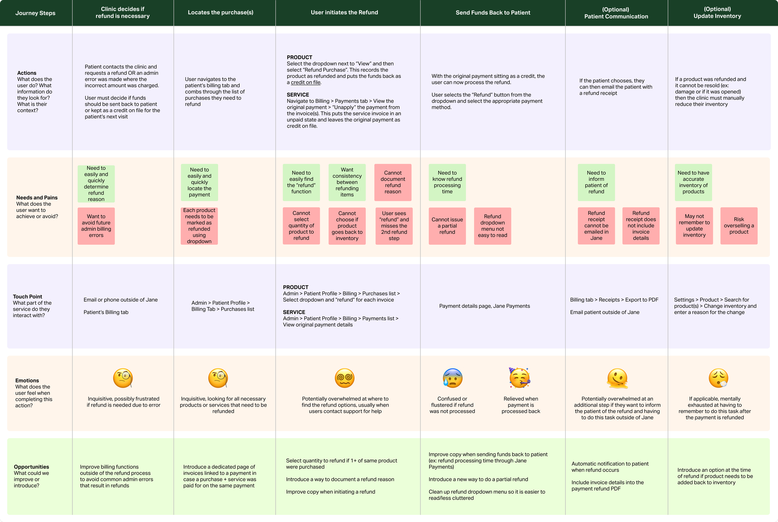
Summary of Pain Points & Limitations
Refunding a payment in Jane varies depending on the item type (service, product, package, or membership) meaning users must remember up to four different workflows. This increases cognitive load and the likelihood of error, especially when encountering a less familiar refund type.
Clinics often express frustration, saying things like: “I probably won’t remember how to do that next time. I’ll just call in again.” The mental effort involved not only eats into their time but also erodes confidence, leading to more support inquiries and less autonomy.
👉 Cognitive Load
Once a refund is initiated and credit is sitting on a patient’s account, the status isn’t always obvious. Language used in the interface can be vague, inconsistent, or missing altogether, especially when dealing with non-traditional refund types like partial refunds.
This leaves users guessing whether their action went through and creates uncertainty about what to do next. When a refund isn’t clearly marked or confirmed, clinics may avoid issuing them altogether to prevent unintended outcomes.
👉 Unclear Status & Copy
Jane currently doesn’t offer a built-in way to capture why a refund is being issued, which means clinics lose valuable business insights. They can add a general note on a patient profile, though it can get lost among the noise.
Was a service refunded because the patient was dissatisfied? Did an insurance estimate change? Was a product returned due to sizing or damage? Without this context, it’s difficult for clinics to spot trends or improve operations.
👉 Lack of Business Context
Issuing a refund rarely happens in isolation. It often triggers follow-up tasks: removing an appointment from the schedule, updating inventory, or notifying a patient.
Today, these tasks are disjointed. Users must remember to take extra steps manually or risk leaving behind an incomplete paper trail. This creates more room for error, especially when the refund process is already mentally taxing.
👉 Missing Accessory Tasks
Design Challenge
🧩
Design Challenge 🧩

How might we make the refund process more intuitive and robust for Jane users so that they can complete this task confidently?
Design Goals
Through this proposed redesign, I want the new refund state to be:
Consistent
Intuitive
Robust
I am setting out to improve:
User Flow – Exploring ways to make the steps to perform refunds easier so that users can confidently repeat this task, no matter what item is being refunded
Functionality – Exploring ways to add missing features that a business needs when performing and documenting refunds
Visual Hierarchy & Copy – Exploring ways to improve the usability through layout, visual queues, and language
Special Notes & Design Considerations❗️
I am designing for refunding products and services (excluding refunding packages and memberships) on desktop view, as this is what and where most users are interacting with refunds in the software.
I want to mirror some aspects of Jane’s software that are familiar to users by taking inspiration and layouts from other areas in the admin.
There are many moving parts in Jane’s Billing product as it interacts with many parts of the software, so implementing any proposed redesign in real life would pose new challenges, considerations, and pivots.
Because this is a self-led design exercise completed during my time in Jane Support, I do not have a thorough understanding of Jane’s code or backend structure. However, I did briefly consult Jane’s Billing Product Managers and Developers to get an idea of the potential technical constraints to implenting a design like the one I proposed.
Some aspects of the overall refund problem space include avoiding billing errors that require a refund in the first place – I explored this angle briefly to see how Jane could prevent future issue avoidance (not covered in this case study).
How We’d Measure Success 🌟
If this proposed redesign was implemented, I would have aimed for and measured:
↓ 20-30% decrease in refund-related support tickets within the first 3 months
↑ User task completion rate for refund workflows without contacting support
↓ Time to resolution on refund-related inquiries
↑ CSAT scores related to financial admin tasks
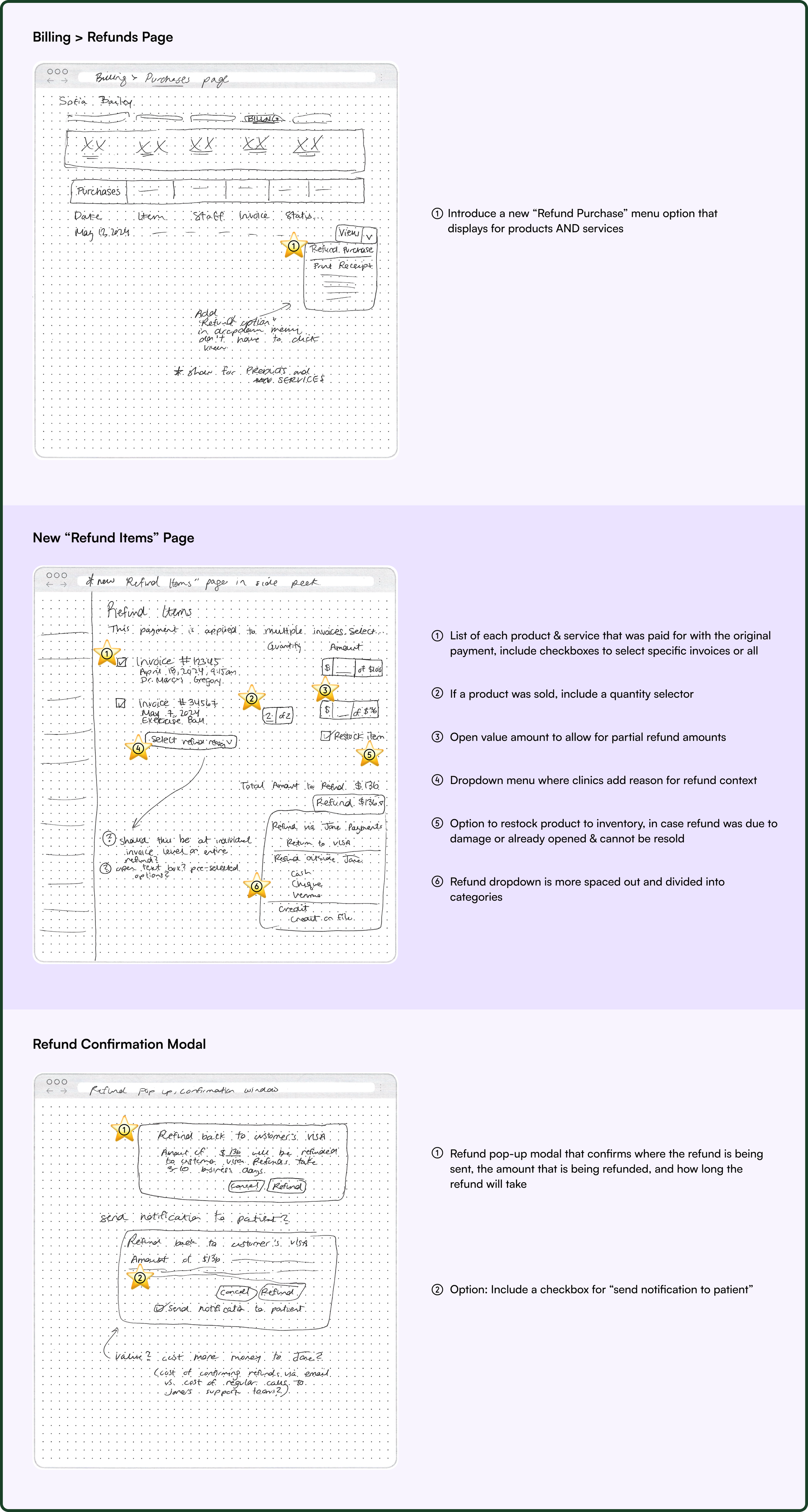
Proposed Modifications & Additions
🔄 Unified Workflow
Focusing on simplifying and consolidating how users access the refund feature.
Introduce refund option in the “View” dropdown for all item types
List all invoices linked to a payment on a single screen
Restructure payment menu for consistency
Allow selection of multiple invoices if one payment covers several items
💡 Why it matters: This makes initiating a refund feel predictable and scalable across services, products, and scenarios.
🧩 Flexible Features
Feature improvements to give users the flexibility they need.
Partial and custom refund amounts
Select refund quantity for individual products
Choose if refunded products go back into inventory
Checkbox: Notify the patient via email
💡 Why it matters: Real-life clinics need more than “full refund or bust.” These tools support edge cases and administrative accuracy.
✨ Visual & Copy Enhancements
Refinements to layout, language, and trust-building moments.
Reformat how invoices are visually displayed
Display a summary of what’s being refunded at the bottom of the page
Improve copy on buttons and banners for clarity
Highlight the final “Refund” CTA with distinct styling (e.g., bright blue)
💡 Why it matters: Clear visual hierarchy reduces error and builds user confidence during a high-stakes task.
Exploratory Sketches
Proposed Redesign
This 1-minute walkthrough goes through each step of the prototype and my design rationale for each decision.
💡 TIP: Hit the settings wheel ⚙️ and increase quality to 1080P HD.
A Little Bit of Feedback & Collaboration 🌟
I had the opportunity to present this redesign to Jane’s Product Design team in a feedback session and received excellent questions and pointers. We discussed options like… “Should the refund reason be a dropdown for each item, or one open text box for the entire refund?” or, “Is this too many tasks to do on a single page? Should this be broken into 2 steps on individual screens?”
Here is what I’d improve in the next iteration based on user testing:
👉 Visual Hierarchy
On the dedicated refund page where each invoice is listed, I would re-order the information and change what is highlighted in the large blue text. It’s not likely that the user needs to know the invoice number, rather the item that is being refunded.
👉 Unified Input
Including a “reason for refund” for each item could be cumbersome, so it may be more useful to have 1 textbox that represents the context for the entire refund, no matter how many invoices were applied to one payment. I would also narrow down the partial refund amount to 1 box.
👉 Graceful Recovery
I recognize that often refunds come from a place of admin error–take the “charging with a package” or “forgot a Friends & Family discount” incidents. I would explore ways to rectify these issues before or as part of the refund process.
I am confident that if this hypothetical redesign was implemented with some tweaks, Jane could achieve:
↓ 20-30% decrease in refund-related support tickets within the first 3 months
↑ User task completion rate for refund workflows without contacting support
↓ Time to resolution on refund-related inquiries
↑ CSAT scores related to financial admin tasks
Reflection
💭
Reflection 💭
Designing from Support
At the time of this project, I wasn’t on the design team. I was a Support Specialist answering tickets, troubleshooting edge cases, and speaking with frustrated users daily. I didn’t have access to user interviews or analytics dashboards. But what I did have was a front-row seat to real user pain.
This refund workflow redesign came from that seat. From hundreds of support conversations, I identified patterns: confusion, repetitive questions, and emotional frustration that could’ve been avoided with clearer UX. I mapped out the existing experience, flagged usability issues, and proposed a more intuitive flow–not because it was my job, but because it made sense for the user. And it was ✨ fun. ✨
What I Did Without Traditional Tools
👉 No user interviews? I had support tickets.
👉 No fancy analytics tools? I had patterns in conversations.
👉 No design mandate? I did it anyway.
💡 Takeaways
UX doesn't need a job title. I didn’t have a formal title or access, just empathy and curiosity. That was enough to make change.
Support sees what research sometimes misses. Our team had direct access to the messy middle of user frustration and that helped me see where the workflow broke down. Support teams are often where the real stories live.
Advocacy matters. Even though the redesign wasn’t launched, my proposal sparked internal discussion and gave me experience in collaborating with designers and presenting ideas to stakeholders.
The redesign wasn’t implemented (such is life!), but the process taught me a lot.